To make the Signal Media tool even more useful we needed to strengthen the USP: Relevancy. In fact, content is key and if we can't provide relevant informations to any type of users we are just an other news provider. We focus on quality rather than quantity.
For that we needed to change our current way of training topics and entities. We needed to have a tool that will help the Data Scientists to gather more data. The more labelling the more data the more accurate we would be. But how to entice analysts to engage more with that? See the process below.
Challenges
- The actual version of the tool is lacking in terms of user experience
- Adapt the back-end infrastructure to the UX requirements
- Balance between deadline, impact, user experience, quality and efficiency
- Scannability
- Data Scientists jargon
- Simplify the experience and improve the quality
- Engage more the analysts
The goal
- Increase the speed of labelling
- Collect more data thanks to a delightful experience
Old tool
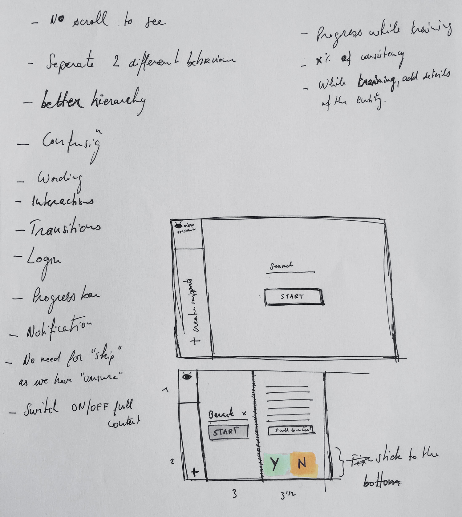
There's 2 different goals combined in one page which makes the hierarchy and the interface confusing. "What should I do?", "Where should I start?". Those questions remain in the user's mind. The wording wasn't straight forward as well.
Once we started the training we noticed that the text goes all the way from left to right. Also, spacing and sizing makes the text harder to read.
How it works?
From the user side
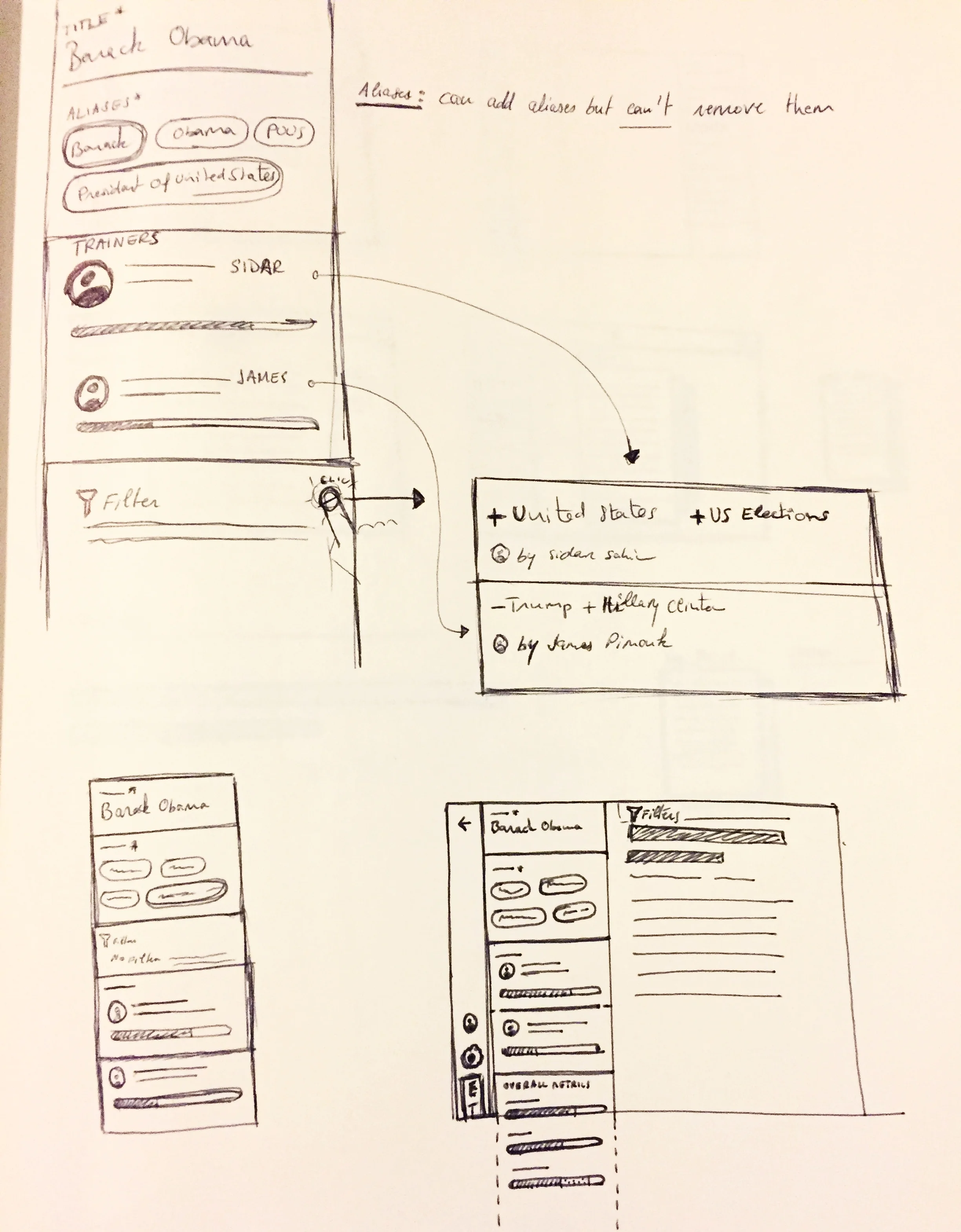
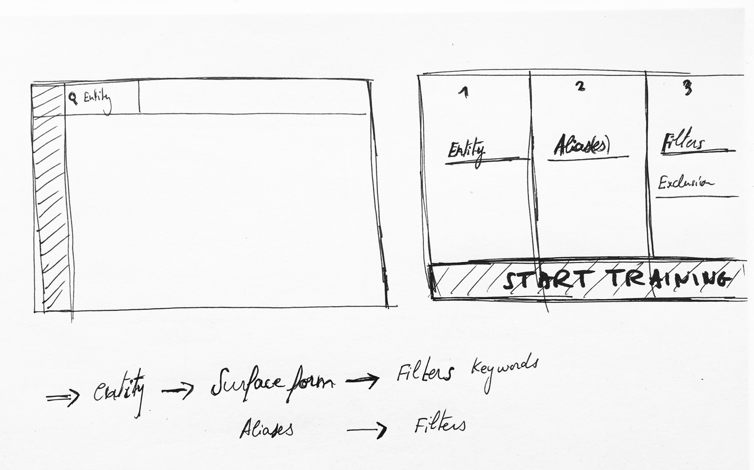
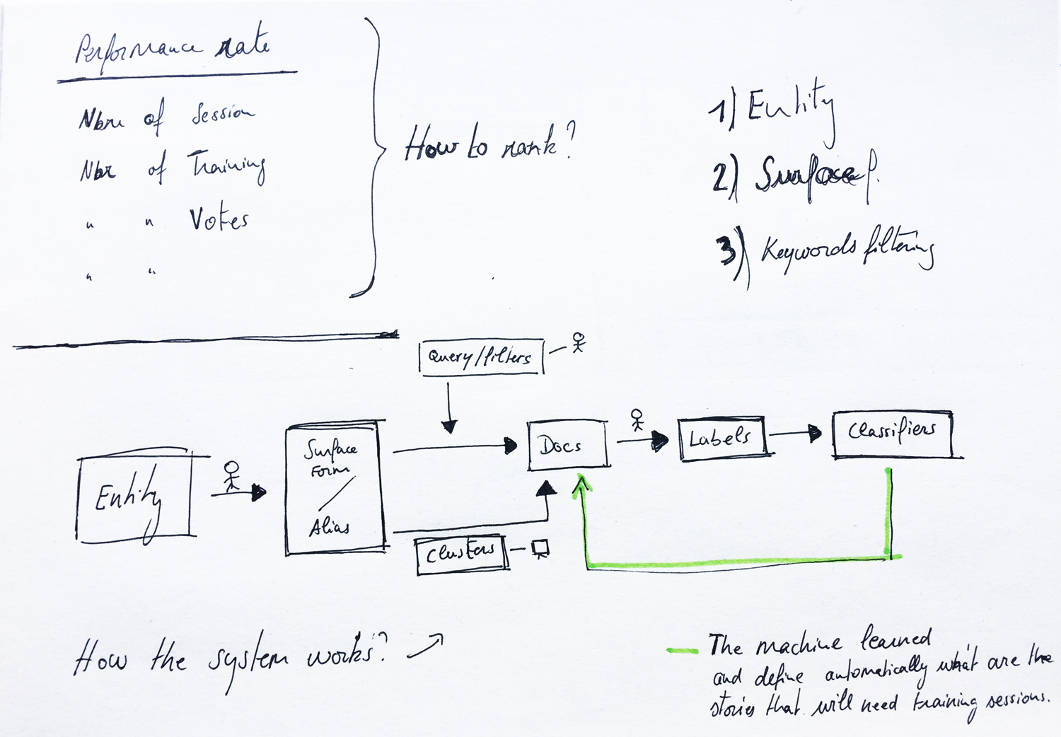
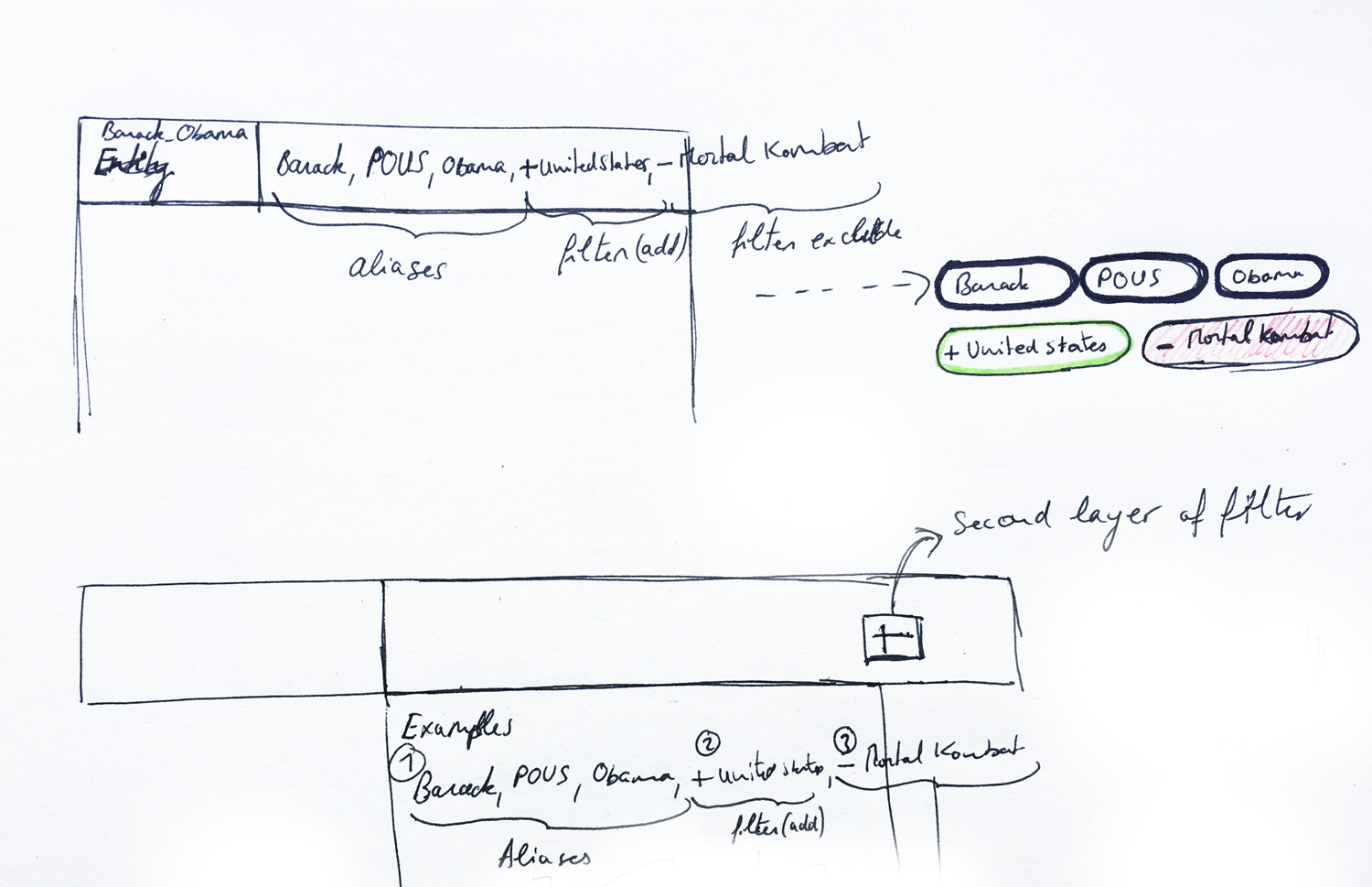
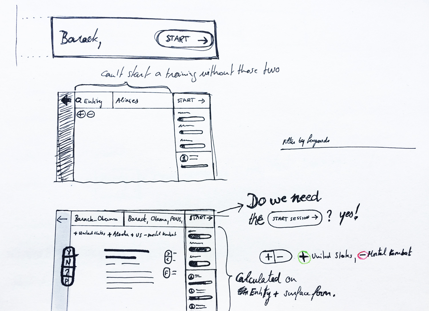
To make sure I understood how the system works I drew the above and talked to the Data Scientists. Each entity can have several training sessions. A training is query that includes an entity and a surface form (aliases). To narrow down the search the analyst will be able to filter. For instance the query might have some exclusions like "-James Cameron". To make sure that we reach a high consistency in our judgement multiple analysts will work on the same training.
From the back-end side. Once we've collected enough data the machine will learn and create and judge by it self.
Design
Gamification
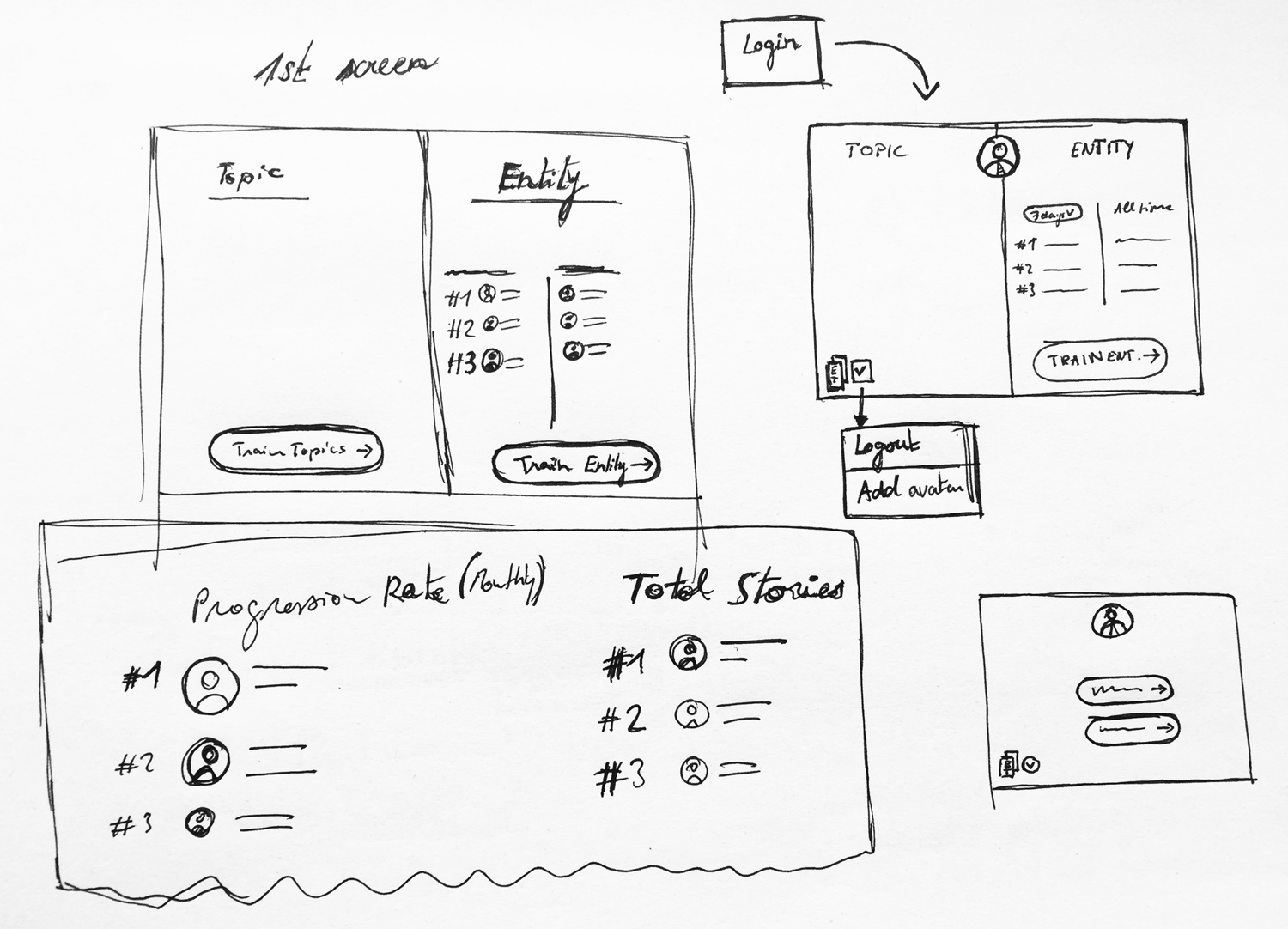
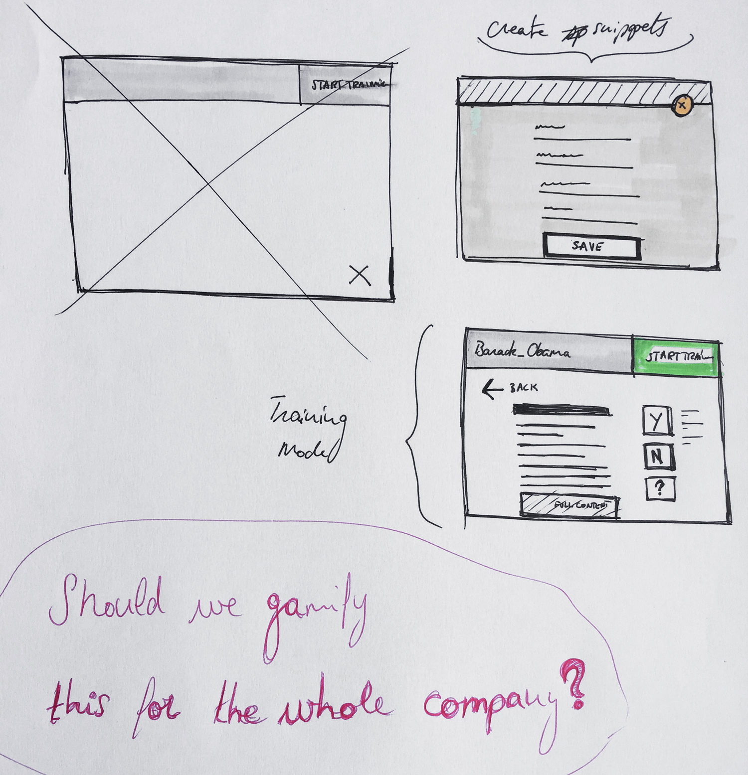
Signal need to collect as much data as possible. A pleasant and easy to use interface will help that but to have a better impact on people we needed to gamify the tool in order to make them come back and do more.
Blue side of the page is just an overview of my trainings. Right now the user don't have any data as he signed in for the first time. Enter the entity title and aliases and the user is good to go. The user clicked on "My sessions" tab but we will display the tab "All sessions" to show a list of training. Therefore the user won't see an empty screen but at least a starting point.
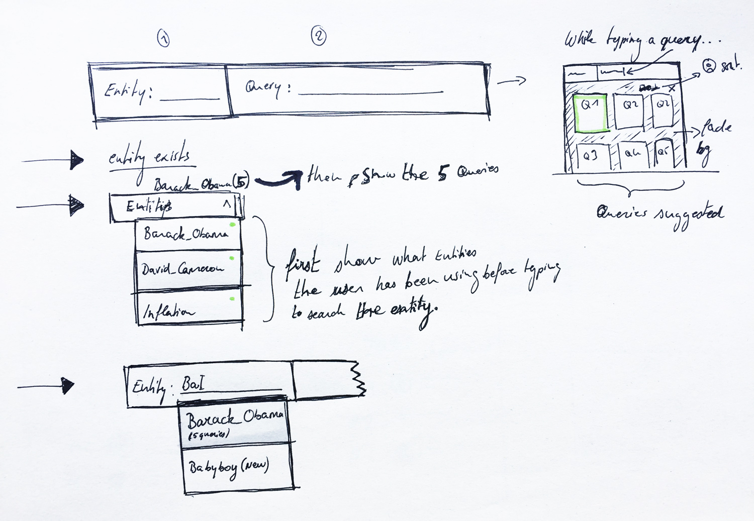
Search for an entity. Start with an existing entity or a new one
Adding a surface form (aliases) to a new entity and then click on "Start training"
This screen shows that the user has been active since. On the left there's a list of trainings that he's involved in.
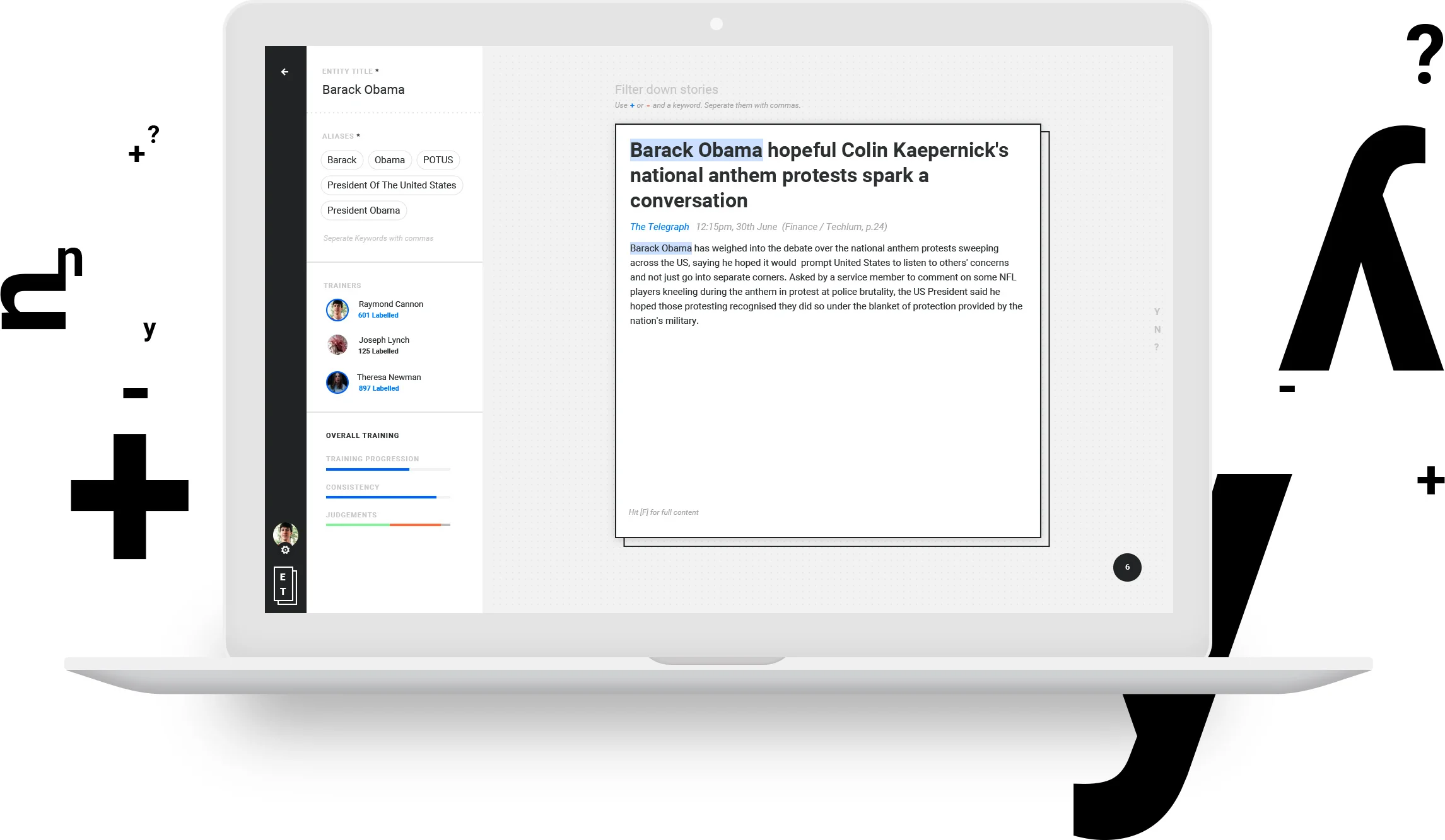
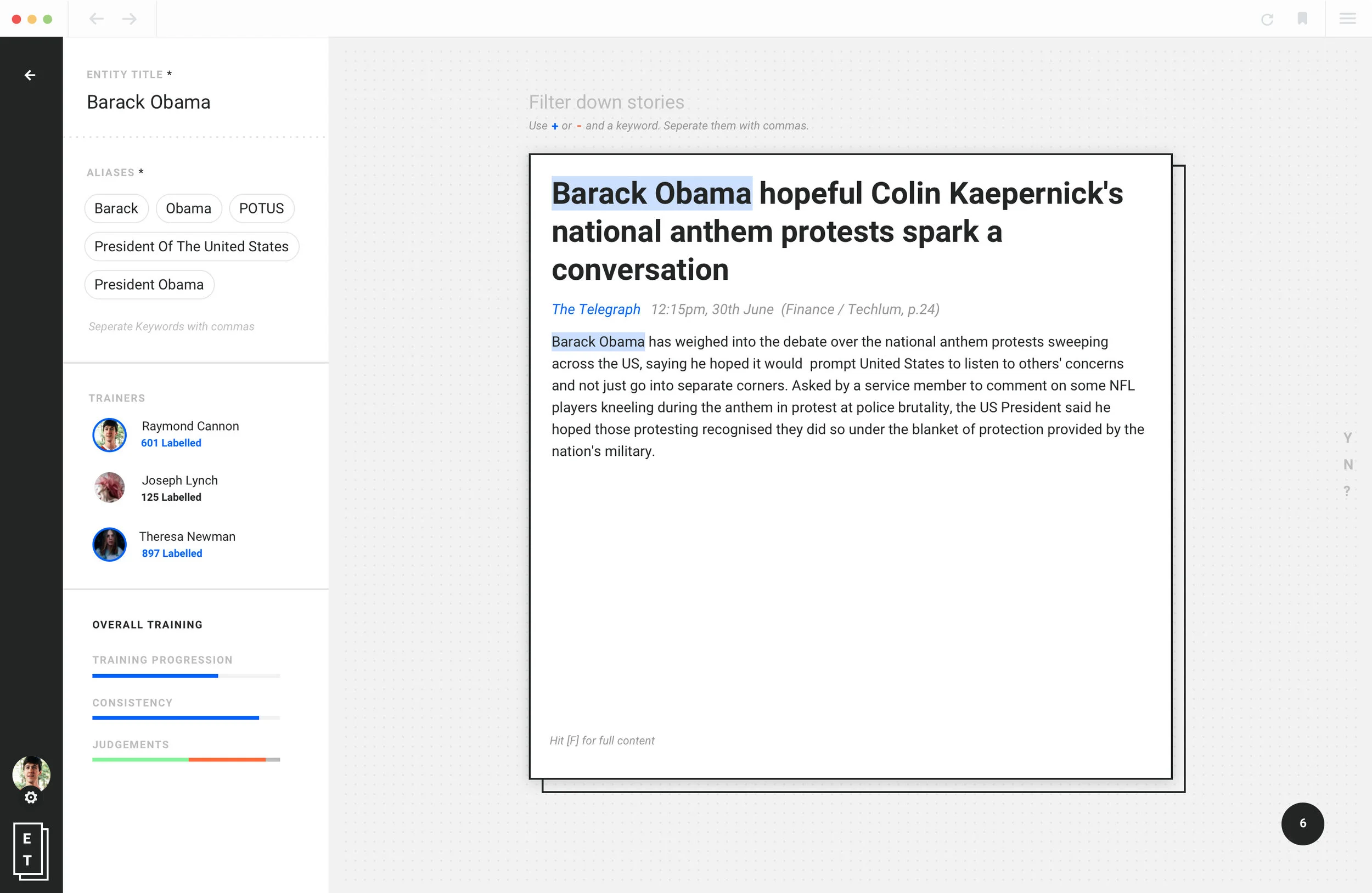
The normal stage of a labelling screen
Hover state
Adding a more context to your search by filtering. Here in the drop down the user will be able to pick the filters made previously by other users involved in the same training [Barack Obama]. Or he can simply do he's own filter according to his need.
Labelling
Once a story has been labelled the right colour is applied and scales down. At the same time the next story comes from the right.
Machine VS Human
Once we've trained an entity and collected enough data the machine will take a 100+ new stories and label them by itself then those same stories will be labelled by humans. We're aiming for a labelling made automatically thanks to active learning.
Interactions
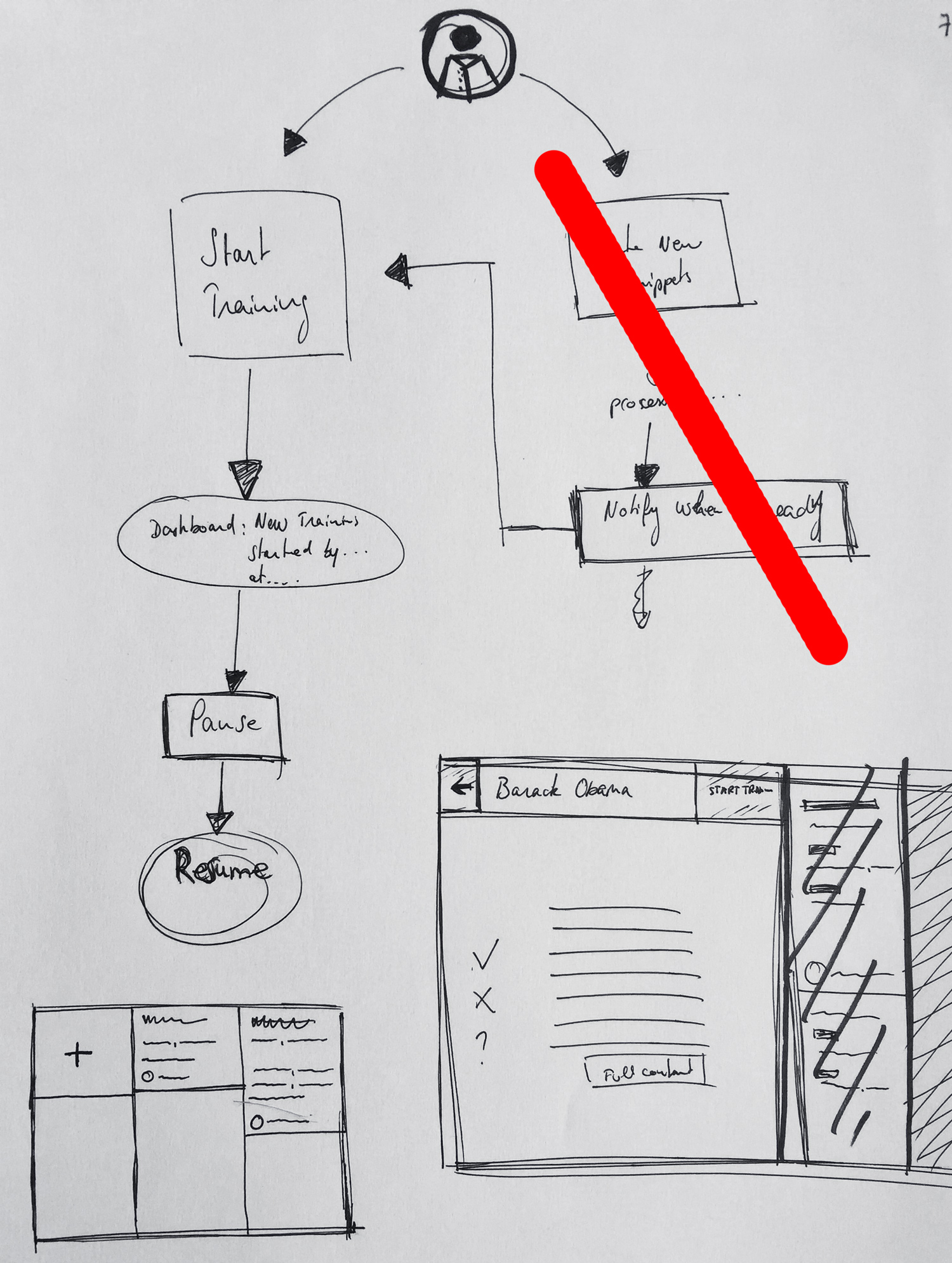
Training that are just being created will go through the form page. However all the ones that are already in the system will start the training straight away. To simplify the experience the user will have to stop by the form to start a new training, modify it or start one he is already involved in.
Logos
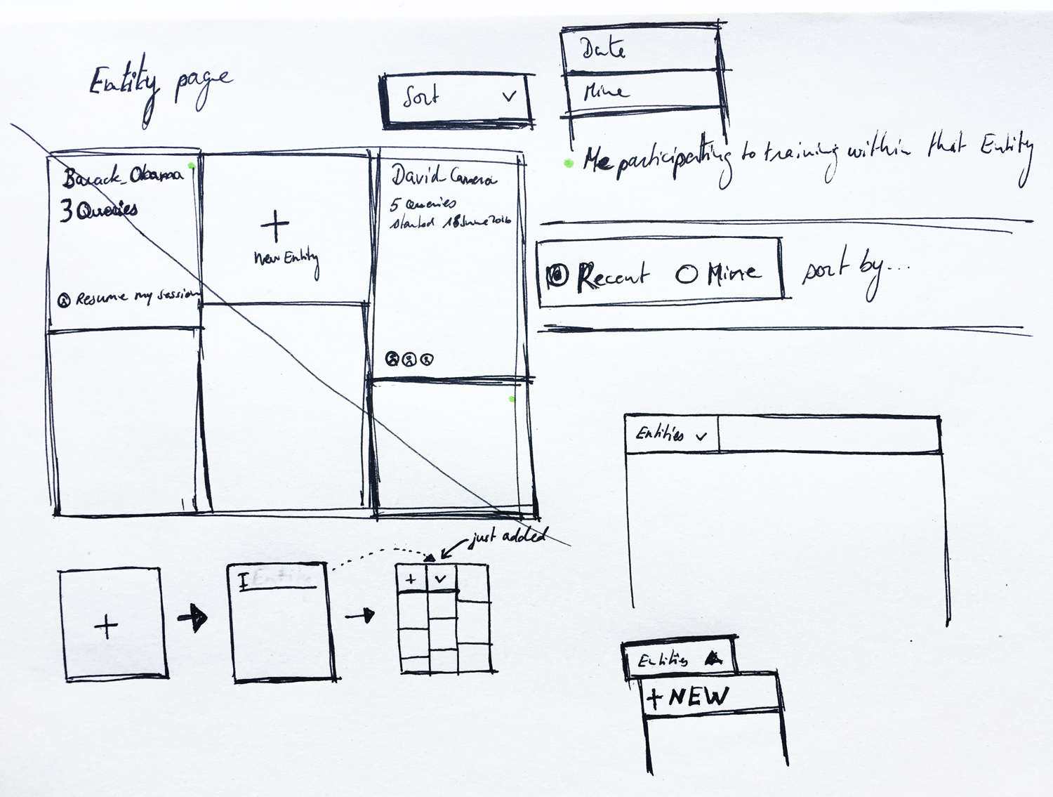
Card design concept
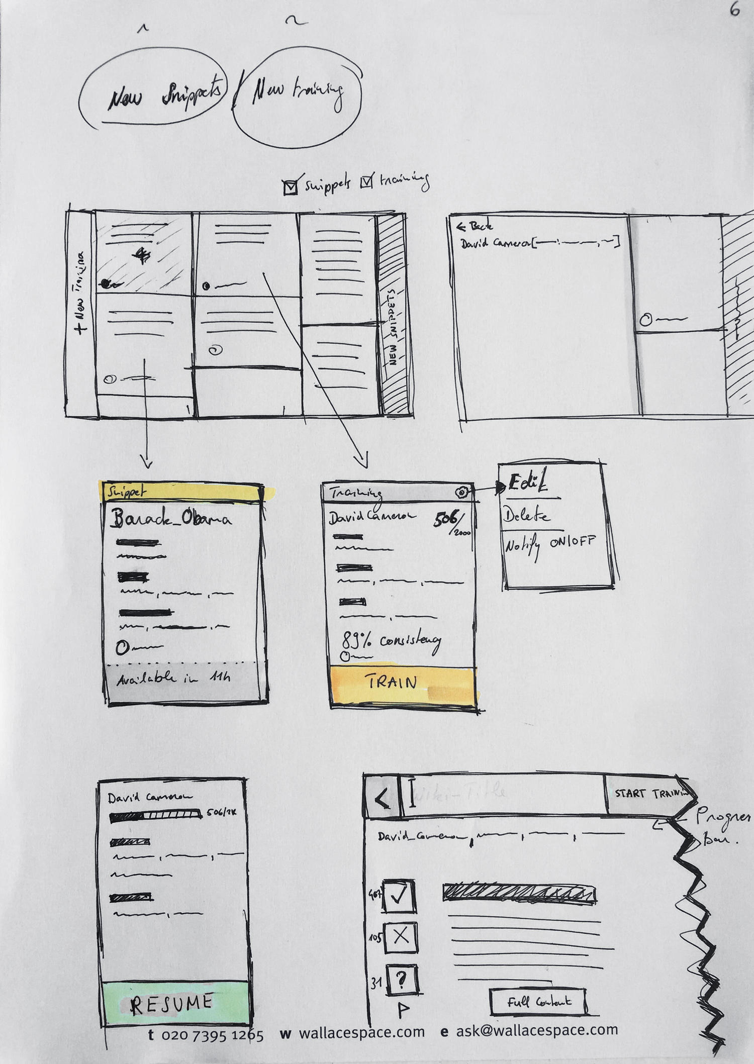
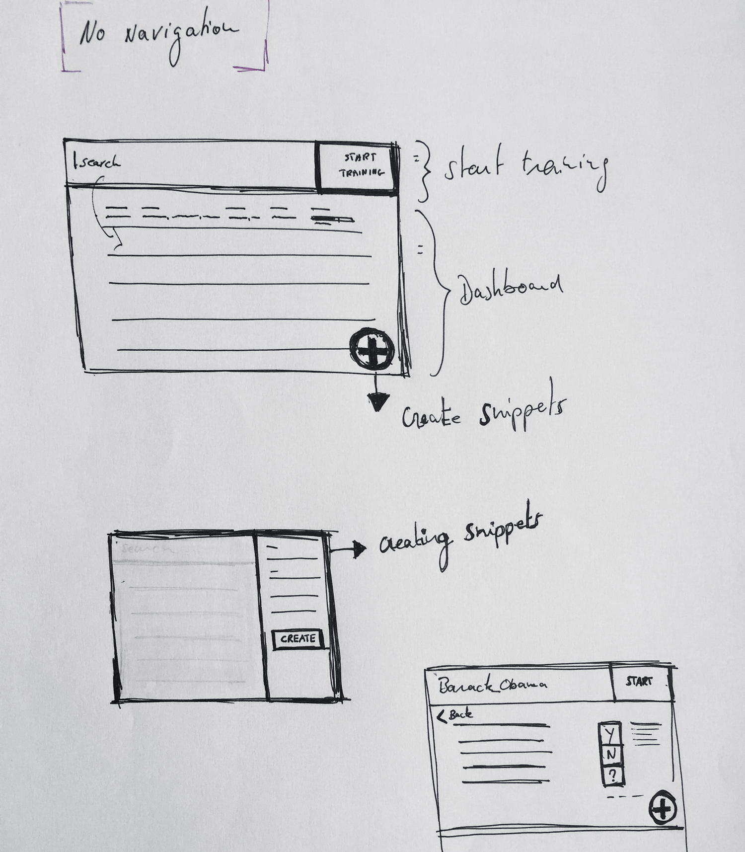
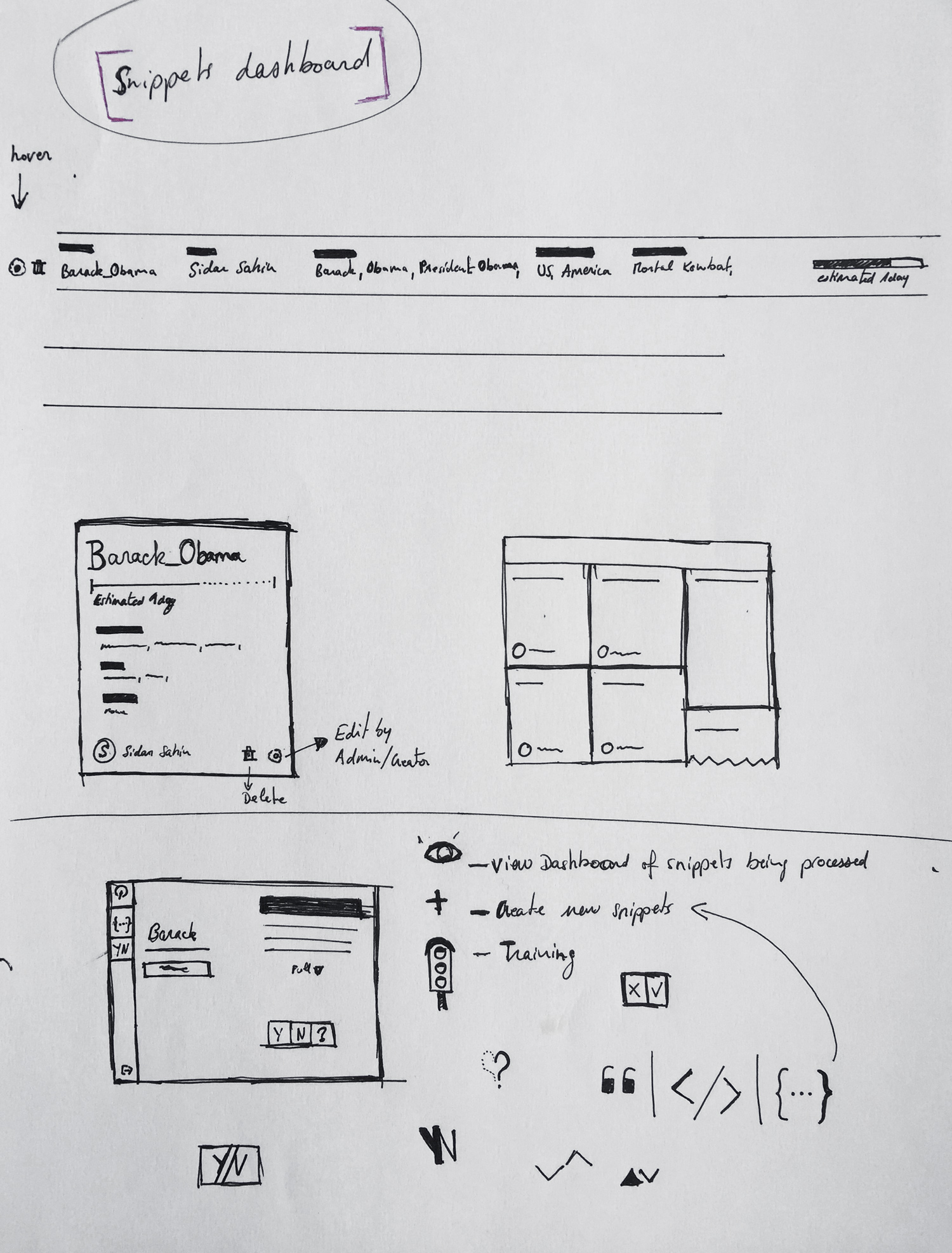
Those wireframes are based on the first iteration. We wanted to have a dashboard that will show us an overview of all the training sessions.
All wireframes

