We need a more efficient way to stay informed
We need information as soon as it happens, and we need it available anywhere
We need to engage our audience with quality real-time news
We need it to be mobile
Allen & Overy client pitched Signal Media to come up with an Entreprise tool that uses Signal's Technology with its ERD (Entity Recognition & Disambiguation). Within less than 2 days I had to design a solution that allows a team of curators to display relevant content to the entire company. For that curators have to build feeds within Signal Media and copy/paste the RSS link to the new interface within their Intranet. Readers will be able to daily check what are the news. Once the feeds are created Admin users won't need to worry about anything as the updates will be made in real-time. Although this new interface will be relevant to their need, the flexibility of discovering the news everywhere at anytime needs further thinkings.
The mobile is the solution to have the news in your pocket. But how? And what do they need it for? It's an other context of use so replicating the same solution won't be sufficient and probably inaccurate.
Thanks to the user research we know why mobile make sense for our users. In order to let them scan what they expect to see they will get access to any feeds built by curators. Moreover, in order to let them discover any kind of news we wanted to allow the readers discover and follow topics.

Newsfeed
At work from the company’s Intranet. Any employees will access to any news from Signal. Thanks to the technology deployed with the Machine learning we ensure a qualitative experience.
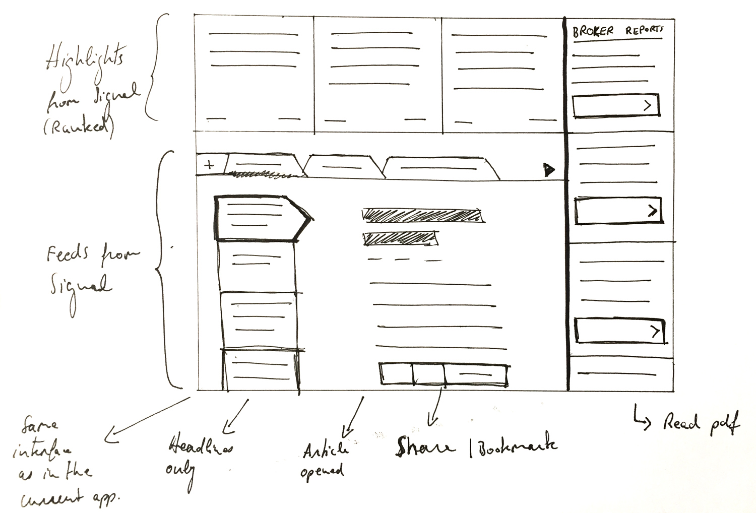
Obviously I kept readers' mental model in the center of the design thinking so that they don't feel confused. I didn’t want to change the way they navigate so I decided to go for an horizontal navigation (Tabs). Because the potential users are used to it as their Intranet uses tabs as their main menu (I can't show their Intranet for confidentiality purposes).
Also, we think images help get the context without reading the entire headline that’s why adding images makes the experience delightful.
As an admin (curator), the user will be able to copy/paste the RSS link by using the "+" button on the left hand side of the top navigation.
"Top stories" section is a combination of recommended articles from all feeds and followed topics. We want users to scan quickly what they shouldn’t miss on a daily basis.
Navigation
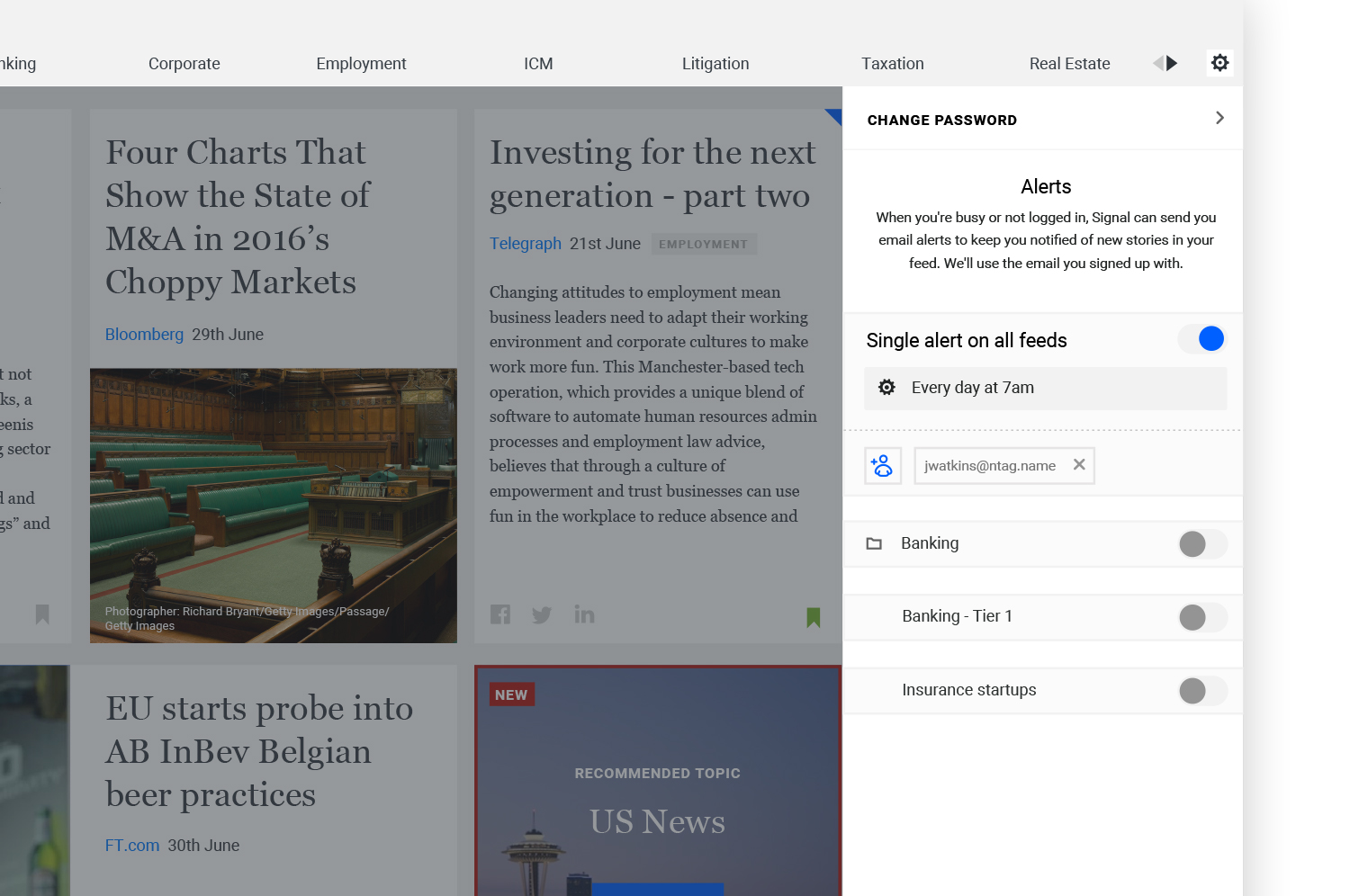
The main navigation allow user to switch between feeds built primarily by the team of curators. Each tab will have this advance dropdown menu (see above). Because I wanted users to set an email alert in context while they are viewing the concerned feed. This feature allows readers to receive content straight to their inbox.
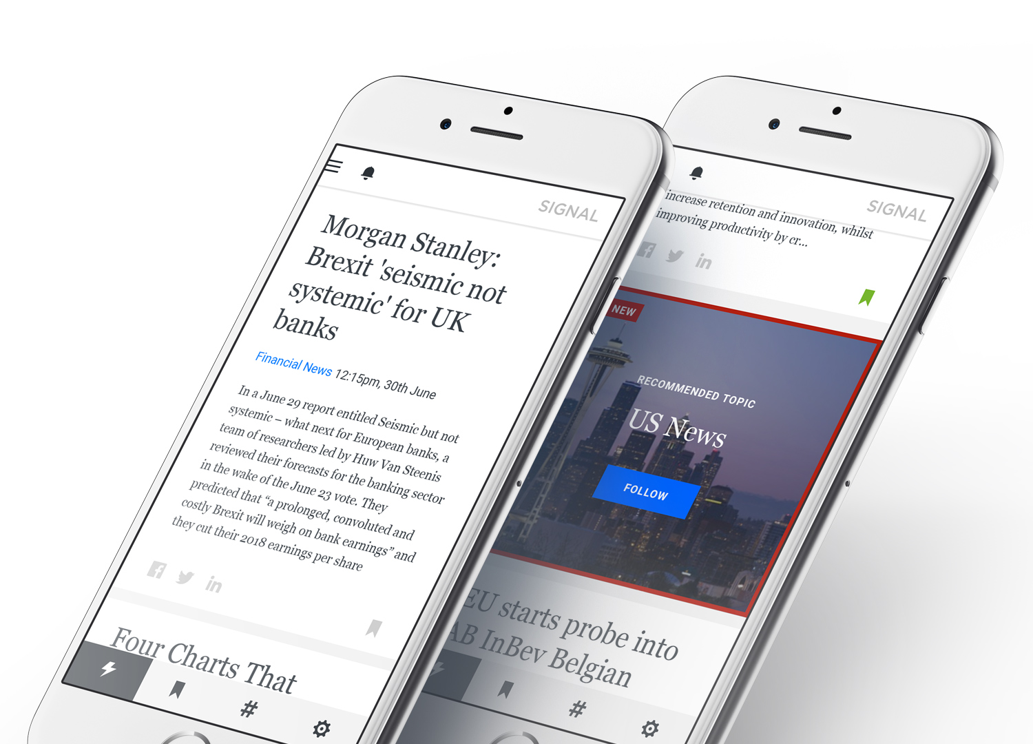
As you can see above this section can also be a discovering area. Readers can follow different topics. The goal is to make this list dynamic so that our analyst can provide trending topics to follow regarding users needs.
Settings
Right-side navigation allows users to access their account settings and have an overview of their alert settings. From that panel anyone can modify the settings at their convenience.
iPad
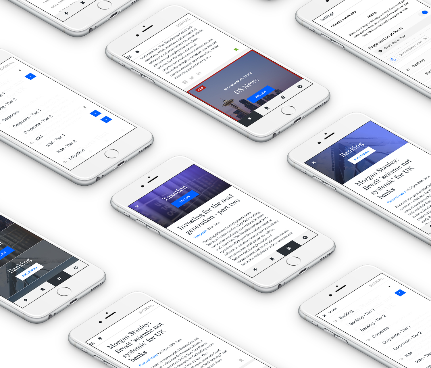
Why not have access in their iPad as well? Especially Execs people need to have access to the information anywhere at anytime. We need to make sure that we're building a responsive tool that makes it easy to consume content in any display.
Real-time Alerts
The technology will allow the real-time alerts. Push notifications might be needed for breaking news and emails for a general need.
Navigation
I want people to access top stories quickly that's why we show it by default. From that page open the sidebar to access any feeds. Also, the bottom navigation allow users to access bookmarks, topics and settings.
Effective
To be more effective we show feeds that has new stories in. Setting alerts is a way of receiving new content.
Wireframes and thoughts


